Picture this: You've invested thousands in securing prime floor space at the UK's biggest trade show in your industry. You've trained your team, prepared your pitch, and ordered business cards. But as visitors stream past your stand, barely glancing in your direction, you watch your competitors across the aisle drawing crowds like magnets.
What's the difference? Often, it comes down to something deceptively simple: your exhibition graphics.
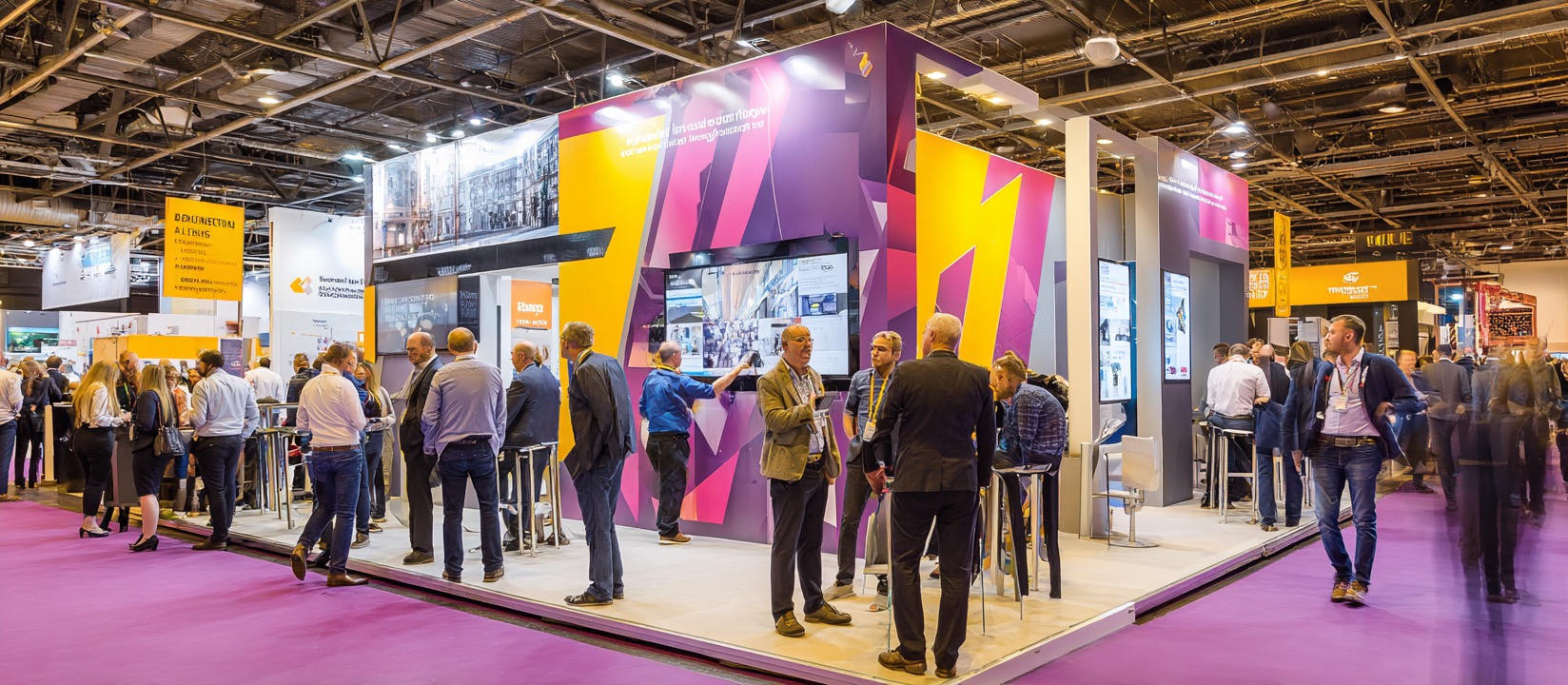
In the split second it takes someone to walk past your stand, your graphics are doing all the talking. They're your silent salespeople, working 24/7 to communicate who you are, what you do, and why visitors should stop. Get them wrong, and you've wasted more than just the cost of printing – you've missed countless opportunities to connect with potential customers.
The Psychology Behind Exhibition Graphics That Work
Exhibition graphics aren't just decoration – they're a carefully crafted communication tool that taps into how our brains process visual information. Research shows that visitors form an opinion about your business within 3-5 seconds of seeing your stand. That's barely enough time to read a sentence, let alone digest complex information.
This is where smart exhibition graphics earn their keep. They work on multiple levels simultaneously. The right colour palette creates an emotional response before visitors even read your messaging. Bold, clear typography ensures your key messages cut through the visual noise of a busy trade show floor. And strategic use of imagery helps visitors instantly understand what you're about.
Consider how portable display stands work in this context. Unlike permanent installations, they need to work harder to grab attention quickly. The most effective ones use high-contrast colours, minimal text, and imagery that tells a story at a glance. They're designed to be conversation starters, not information dumps.
The positioning of your graphics matters too. Eye-level content gets noticed first, whilst anything below waist height often goes unseen in busy exhibition halls. Smart exhibitors use this hierarchy to their advantage, placing their most important messages where they'll have maximum impact.
Common Exhibition Graphics Mistakes That Kill Visitor Engagement
Walking through any UK trade show reveals the same graphic mistakes repeated stand after stand. The most damaging? Trying to cram everything onto your display. Many businesses treat their exhibition graphics like a company brochure, stuffing every service, product feature, and testimonial into the available space.
This creates visual chaos. Visitors can't quickly identify what you do or why they should care, so they simply move on. Your graphics should follow the hierarchy of communication: headline first, supporting message second, detailed information third. Each element should have breathing room.
Another common pitfall is using poor-quality images. Pixelated logos and stretched photos instantly communicate that you cut corners – not exactly the impression you want potential customers to form. Trade show displays UK businesses use successfully always feature crisp, professional imagery that looks sharp even when printed large.
Typography trips up many exhibitors too. Fancy fonts might look clever on screen, but they become unreadable from the distances typical at exhibitions. Sans-serif fonts like Arial or Helvetica might seem boring, but they're proven performers for exhibition graphics because clarity trumps creativity when you have seconds to make an impression.
Colour choices often reveal businesses that haven't thought strategically about their environment. Exhibition halls typically use harsh fluorescent lighting that can wash out pastels or make certain colour combinations appear muddy. The graphics that stand out use bold, contrasting colours that remain vibrant under any lighting conditions.
Creating Graphics That Stop Traffic and Start Conversations
The most effective exhibition graphics follow a simple formula: they attract, inform, and invite action. But executing this formula successfully requires understanding both design principles and human behaviour.
Start with your headline – the single most important element on your display. It should be readable from at least six metres away and communicate your core value proposition in five words or fewer. "Britain's Fastest Delivery Service" works better than "Providing Comprehensive Logistics Solutions Across Multiple Sectors Throughout the UK."
Your supporting graphics should create a visual journey that guides visitors' eyes through your key messages. Use arrows, pathways, or strategic colour placement to create this flow. The best portable display stands manage this journey across multiple panels, creating intrigue that draws people closer to read more.
Images are your secret weapon for creating emotional connections. Instead of generic stock photos, use images that show your product or service in action. If you're a catering company, show delighted guests at an event. If you manufacture machinery, show it solving real problems in authentic settings.
Don't forget about practical considerations. Your graphics need to look professional when packed and unpacked repeatedly. This means choosing materials that resist creasing and printing methods that won't crack or fade. It also means designing with assembly in mind – graphics that require perfect alignment might look great fresh from the printer, but they're a nightmare to set up under time pressure.
Consider your lighting strategy too. Many successful exhibitors incorporate LED strips or spotlights into their display design. This isn't just about visibility – strategic lighting can make colours more vibrant and create depth that makes your stand more inviting.
The ROI of Professional Exhibition Graphics
Quality exhibition graphics represent an investment, not just a cost. When done properly, they transform your exhibition presence from a business card handout session into a lead generation machine.
The numbers tell the story. Exhibitions with professional graphics typically see 40% more visitor engagement than those with basic displays. More importantly, the conversations tend to be more qualified because your graphics have already communicated what you do and attracted people with genuine interest.
Consider the lifetime value of a new customer against the cost of professional exhibition graphics. For most businesses, acquiring just one significant client pays for the entire graphic investment many times over. This makes spending on quality graphics one of the smartest marketing decisions you can make.
Professional graphics also work harder for longer. A well-designed display system can serve multiple events over several years, whilst cheap alternatives often look tired after their first outing. When you factor in the cost per event, the professional option often proves more economical.
Remember that your graphics represent your brand long after the exhibition ends. Photos from events appear in marketing materials, on websites, and in social media posts. Poor graphics create a poor impression that extends far beyond the exhibition hall.
Your exhibition graphics are silent ambassadors for your business, working tirelessly to attract, engage, and convert prospects into customers. They deserve the same strategic thinking and investment you'd give any other crucial business tool. Get them right, and watch your exhibition ROI soar. Get them wrong, and even the best product or service might go unnoticed in the crowd.